Essentials of Excel


Excel is the tool-of-choice in business right now.  Excel is a spreadsheet program with lots of bells-and-whistles. Getting good with Excel requires experience. These notes will help you gain initial experience, but there is much more to learn about this program.  You might want to purchase a dedicated Excel book. LOTS of Excel books are available, so choose one that suits your needs.


Finally, the material in this course is designed for Excel 2002; the version bundled with Office XP. You might have a computer at home with Excel loaded. Will the instructions in this course pack work? I don’t know J. The differences between Excel 2002 and recent prior versions are not big; the instructions may need minor adjustments but not much.


Main Contents:

·        Creating a worksheet

·        Adjusting columns

·        Entering Data

·        Creating formulas

·        Built-in Formulas

·        Formatting to improve appearance

·        Simple Graphs


The materials were developed by Professors Brian Lilly and Barry Mulholland.

Getting-started Excel basics

What is Excel and what is a worksheet

Starting or adding a blank worksheet

Opening an existing worksheet

Deleting, naming, and moving worksheets

Moving a range of cells using the drag functionality

Using the drag handle to have Excel create a series of numbers

Adjusting the width of a column and the height of a row

Deleting columns and rows

Hiding and unhiding part of your spreadsheet

Freezing Panes to prevent the top or left of your sheet from scrolling

Excel has good online-help


What is Excel and what is a worksheet


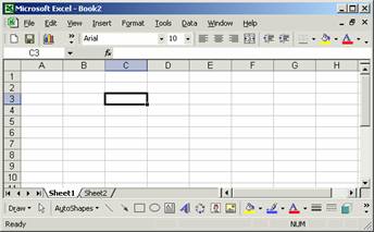
Excel is a software program. Excel presents you with a worksheet like the one pictured below. This worksheet has rows and columns. How many rows and how many columns? I don’t know. More importantly, I have never run out of space in a worksheet, so do not worry about it J!


Excel has a menu bar and various toolbars you can turn on or off.


The toolbar on the bottom is a drawing toolbar.


Anyway, you can enter text or numbers in each cell. In the figure above, cell C3 has been selected and is ready to receive text. When using Excel you reference cells with the column‑letter and then row‑number, so C3 in this case. What if you are in a column past Z? Then you will see columns AA, AB, AC, and so on.


You can have more than one worksheet in a workbook. The worksheet above is one of two worksheets in a workbook.


Finally, a range of cells means more than one cell. So if you select range A1 to C3, then you would have selected a range containing nine cells. The range would be called A1:C3.


Starting or adding a blank worksheet


When you start Excel you will get a new blank workbook, typically with three worksheets. If you are already using Excel and you want a new worksheet, then you need to decide whether you want a new worksheet in your existing workbook, or whether you want a new workbook. This decision is simply a decision about how you wish to organize your worksheets and files J.


·                If you want to add a worksheet to your existing workbook, so that all worksheets are in one workbook file, then on the Excel menu bar select Insert, Worksheet.

·                If you want a new workbook, then click File, New…, and choose workbook.


Finally, you should know that Excel starts workbooks with three worksheets, but you can add as many worksheets as you wish, limited only by the memory capacity of your computer.


Opening an existing workbook


Again, this one should be easy. Excel workbook files are named with the extension *.xls. Double click an Excel workbook and Excel should launch, opening the workbook. If the workbook opens and you see a worksheet you did not expect to see, then look at your worksheet tabs located toward the bottom left corner. Perhaps you are not looking at the right worksheet within the workbook.


If someone sends you an email containing a workbook file as an attachment, you can generally open the file by clicking on the email attachment icon. But this depends a bit on your email program and how you have set the preferences for your email program.


If you are already in Excel and want to open another workbook, use the menu bar and select File, Open. Or use the keyboard  shortcut, Ctrl + O. Just find the workbook you want and open it. You can have multiple workbooks open at one time.


Finally, if you are trying to get a file from the web, then you should avoid a couple traps. Looking at a worksheet in a web browser is not the same as looking at the worksheet in Excel. So download the workbook file to your computer and then open the workbook. And if you wish to use the web frequently to access or examine data, you might prefer Internet Explorer over Netscape Navigator. Internet Explorer and Excel are both Microsoft products and are very compatible. Transferring data from Netscape Navigator to Excel is sometimes a bit harder.


Deleting, naming, and moving worksheets


Toward the bottom-left corner of Excel you will see a tab for each worksheet in your workbook. The workbook shown below contains three worksheets, simply named Sheet1, Sheet2, and Sheet3. You can see that the active sheet is Sheet3.


Each worksheet will have a tab. Use the tabs to see different worksheets and to rename, delete, and move your worksheets.


To rename a worksheet, simply right-click the worksheet tab, select Rename, click somewhere inside the existing name, and simply enter a new name. You should notice that the options you saw when right-clicking also include Delete. So right-click and select Delete to delete a worksheet. Finally, you can simply put your cursor over a worksheet tab, depress the left mouse button, and drag the worksheet if you want to move it, for example to change the order of your worksheets within a workbook, or to move a worksheet to a new workbook.


Moving a range of cells using the drag functionality


Moving cells in Excel is simple. Just click on a cell to select it. Depress your left mouse button and grab the perimeter of the cell, which should be highlighted with a thick black border (grab anywhere except the very bottom right corner). Drag the cell where you want it, and then release your mouse button.


Suppose you want to select a range of cells instead of one cell, and then move the entire range. Not a problem. Just put your cursor over a cell, depress the left mouse button, and drag. You should see a range of cells selected that expands with your drag motion.


Once a cell range is selected, to move the range, again just grab the perimeter of the cell range and drag your mouse. The entire range should move.


Using the drag handle to have Excel create a series of numbers


A

B


A

B

1

Year

Machines

1

Year

Machines

2

2000

8

2

2000

8

3

2001

10

3

2001

10

4


4

2002

12

5


5

2003

14

6


6

2004

16

7


7

2005

18


Suppose you started adding two machines to your shop each year, starting with 8 machines in year 2000. To “fill in” Cells A4 through A7, select the range A2 through A3, and grab the bottom right corner, which should have a drag box. Just drag down and release in Cell A7. How about if the series goes up by multiples of two, or some other number? No problem. Try the same thing in Column B, starting with the range B2 through B3.


Adjusting the width of a column and the height of a row


Sometimes you will want to adjust the width of a column. For example, the figure below shows a worksheet where cells A1 and A2 both contain “Position Description”. Cell B2 is empty, so you can see all of the text in cell A2. But cell B1 is not empty, and so the text in cell A1 is cut off.


Each column has a marker you can right-click.


You can adjust the width of a column in three ways:

·                Grab the vertical line that divides the columns, just above row-1, and drag,

·                Double-click the vertical line that divides the columns, just above row-1, and Excel will automatically adjust the width to accommodate your longest entry in the column,

·                Right-click on the column marker, which is the letter above row-1, and select Column Width… You will see a dialog box where you can specify a column width. You can use this method to adjust the widths of several columns at once.


The same techniques can be used to adjust row heights. You might want to adjust row heights if you are using large font. But more frequently you will probably want to adjust column widths.


Deleting columns and rows


Right-click on a column marker and click Delete. Want to delete several columns all at once? Just drag over the column markers to select the columns you want to delete. Then right-click on one of the selected column markers and click delete. Delete rows the same way!


Hiding and unhiding part of your spreadsheet


Now suppose you have a big spreadsheet and do not want to look at the whole thing. Or suppose you have a spreadsheet containing company data, and you want to show some of the sheet to a visiting customer, but you want to hide part of the sheet. Just right-click on a column marker and select Hide. Or drag to select multiple columns and then Hide them all at once. To unhide hidden columns, select the columns surrounding the hidden columns, right-click, and choose Unhide. Again, rows work the same way, so you can hide/unhide columns or rows.


Freezing Panes to prevent the top or left of your sheet from scrolling


Frequently you will have headings in your top row and your left column. You may want your headings to stay visible when you scroll around your spreadsheet. Look at the two figures below.


The figure above has year headings in row‑1 and cost headings in column A. To prevent the headings from moving, select Cell B2, then from the menu bar select Window, Freeze Panes. When you then scroll down the worksheet a bit, and you see the result in the figure below. The headings in row-1 have not moved; they have been “frozen” to stay visible.


So when you select a cell and freeze panes, everything above and to the left of the selected cell is frozen and will be visible when you scroll. To unfreeze panes, just go back to the Excel menu bar and select Window, Unfreeze Panes.


Excel has good online help


Using online help is something that lots of people do not like. Get over it. If you want to become good at using Excel, at some point you should become comfortable using Excel’s online help. From the menu bar, just select Help and follow along.


Entering data and writing formulas in Excel

Entering text and numbers

Use the equal sign at the start of a formula

Creating simple arithmetic formulas

When an empty cell is referenced, Excel may act as though the cell contains a zero

Relative versus absolute cell references


Entering text and numbers


When you want to enter a heading or a number, just select a cell and start typing. You can also type in the Excel formula bar as shown below. The figure was created by selecting Cell F5 and typing into the formula bar. The formula bar is easy to read because lots of space is available.


Use the equal sign at the start of a formula


In general, Excel will left-align regular text and will right-align numbers. When you enter words into a cell, Excel recognizes your typing as text, meaning not numbers. If you type a number into a cell, Excel will recognize your typing as a number.


But if you enter a formula with two numbers, such as 2 + 3, Excel sees the plus sign, which is not a number, and treats your whole formula as though it were text. So when you select a cell and type 2 + 3, you want to see the math result, 5, but instead you see the formula, 2 + 3.


Just start each formula with an equal sign. So enter = 2 + 3. Then your cell will show 5. You can also use the plus sign. So entering + 2 + 3 will yield the same result, 5.

Creating simple arithmetic formulas


Suppose you have a set of numbers and you want Excel to add them. The figure below shows a monthly bonus earned by three employees, Julie, Jason, and Rebecca. The bonus total was $1500 during January, $2000 during February and $2500 during March.


You see the correct total shown in Cell B6, $1500. If you look at the formula bar, you see the equation =B3+B4+B5. So the formula in Cell B6 simply adds whatever values are contained in the three cells B3-B5. By using the formula, if you change a value in cell B3, Excel will update the value in cell B6.


You can copy and paste formulas. If you copy Cell B6 and paste into Cell C6, you will get the correct result for February. Excel realizes that you want to copy the formula in a different column, and so in Cell C6, the result of your copy/paste is the equation =C3+C4+C5. And pasting the formula in Cell D6 gives you the total bonus for March.


When you create a formula, you can refer to any cell in your worksheet. In fact, you can refer to cells in other worksheets, even if they are in other workbook files! This is quite handy when you want your formula result to reflect current values in other cells.


Excel uses the hierarchy taught in algebra, reading formulas left-to-right, multiplication and division before addition and subtraction, material in parentheses first, and so on.


When an empty cell is referenced, Excel may act as though the cell contains a zero


Be careful. Suppose you are adding monthly bonus amounts above, but Julie’s January bonus has not been determined, so Cell B3 is empty. Cell B6 will show 1000, which is fine. But suppose you want to evaluate employees in terms of their share of the total bonus. If each employee bonus is $500, then each employee earns 1/3 of the total. If Julie’s bonus has not been determined yet, her share is unknown, not zero. But if Cell B3 is empty, the formula = B3 / B6 will yield zero because Excel treats the empty cell as a zero!

Relative versus absolute cell references


When you refer to a cell in a formula, such as = A1 + 2, you are referring to the column and the row, so column A and row 1. So if you enter the number 1 in cell A1, and then you select cell B2 and enter = A1 + 2, you will end up the value 3 in B2. Continuing, suppose you then copy cell B2. You are really copying the formula, which is = A1 + 2. Now if you paste the formula in cell C3, you get the result 5! What happened? When you copy cell B2, Excel reads the A1 reference as: one-column-to-the-left and one-row-up. So the formula you “copied” is:


= (one-column-to-the-left and one-row-up) + 2


So pasting into cell C3 yields one-column-to-the-left and one-row-up + 2, which is B2 + 2.


The reference to Cell A1 was a relative reference. The reference to column A and row 1 was copied relative to cell B2 and then pasted relative to wherever you paste.


What if you want to copy and paste a formula but you do not want the reference to change? Consider the figure below. Cell C4 reports the number 50, which is the dollars earned by Julie, based on 5 hours worked times $10 per hour. The result 50 was achieved by typing the formula = B1 * B4. But when this formula was copied into Cell C5, the result is zero. Why?


When Cell C4 was copied, the formula copied the B1 reference as “one-column-to-the-left and three-rows-up”. So when the formula was pasted into Cell C5, the result is = B2 * B5, which is shown in the formula bar J. Excel simply took the formula in Cell C4 and modified it when copying and pasting. You have a moving-cell-reference problem!


Really in Cell C5 you want the formula = B1 * B5. And in Cell C6 you will want the formula = B1 * B6. In other words, you want the reference to Cell B1 to remain absolute. B1 contains your wage rate, and you do not want the reference to Cell B1 to move. You do want the reference to the employee hours to move, so that the formula for Julie’s earnings reflects Julie’s hours, and the formulas for the other employees reflects the hours they worked.

One simple adjustment will take care of the moving-cell-reference problem.


In cell C4, instead of entering = B1 * B4, insert a dollar sign before the 1 in B1. So your formula in C4 will be = B$1 * B4. The dollar sign is inserted before the row portion of the B1 reference. When you copy this formula, Excel will really copy “one-column-to-the-left and Row-1”. So when you paste this formula into cells C5 and C6, you get the correct numbers as shown below.


The general rule is easy. If you want a reference to a cell to move when you copy and paste a formula, then just type the cell address, such as B1. If you want the column to stay put, but the row can move, then type a dollar sign in front of the column letter, so $B1. If you want the column to move during the cut and paste, but you want the row to stay put, then insert a dollar sign in front of the row number, which is shown in the figure above. And if you want the column and row to both stay put during a formula cut and paste, then insert dollar signs in front of the column letter and in front of the row number. In this case, you would enter $B$1.


The F4 shortcut is handy to know. In the formula bar, put your cursor next to a cell reference and click F4. If your cell reference has no dollar signs, Excel will insert column and row dollar signs. If you continue to click F4, Excel will move the dollar signs around for you. Try it.


How about a simple two-question quiz?


1.              Suppose cell A1 contains the number 10. In Cell A2 you enter = A1 * 2 + 20. You copy Cell A2 and paste into Cell A3. What do you get in Cells A2 and A3?


2.              Suppose cell A1 contains the number 10. In Cell A2 you enter = A$1 + 2 * 20. You copy Cell A2 and paste into Cell A3. What do you get in Cells A2 and A3?


Answers: For Q1, you should get 40 and 100. For Q2, you should get 50 and 50. In both formulas, the multiplication will be conducted before the addition is conducted, so Q1 really reads = (A1 * 2) + 20, while Q2 reads = A1 +  (2 * 20). And the reference to cell A1 will become a reference to Cell A2 when you copy and paste in Q1, but not in Q2.

Some formula-based and menu-driven functions

= sum

= average

= min and = max


What is a built-in function? Very simply, this is some programming that has been written for you. You access a little program that performs a function. Excel has LOTS of built in functions. Some of the most common are discussed here. This list barely scratches the surface. Your homework assignments involve all of these functions plus a few more.


Two other things are good to know about functions. They are bulleted here and then an example is provided under the function described below, the = sum function.

·        More than one function can be used in a formula.

  • Absolute versus relative references still apply.


= sum


Not surprisingly, one of the most common tasks conducted with numbers is to add a bunch of numbers in a set. If you have a column of numbers, you can sum all numbers using the = sum function. So if you have 10 numbers in cells A1, A2, A3, …, A10, you do not need to reference each cell. So instead of = A1 + A2 + A3 + … + A10, you enter = sum(A1:A10).


Got 5000 numbers in column A, starting in A1? Easy…  = sum (A1:A5000). Got numbers in a row, maybe in cells A1 through T1? Try = sum (A1:T1). Now suppose you’ve got ten numbers in A1 through A10 and another ten numbers in B1 though B10. The numbers in column A are employee salaries for the year 2002, and the numbers in column B are employee salaries for the year 2001. What was the total salary across both years? Enter = sum (A1:B20) to find out.


Now to illustrate a function with more than one formula. How much did salaries grow from year 2001 to year 2002? Enter = sum (A1:A10) / sum (B1:B10). Suppose you expect a 5% growth in salaries when moving to year 2003. The projected 2003 salary budget? = sum (A1:A10) * 1.05.


And to illustrate using relative versus absolute references, suppose you have the spreadsheet shown on the top of the next page. The worksheet shows salaries for three employees across the years 1997-2002. The formula in Cell B6 is = sum (B3:B5), and then Cell B6 was copied and pasted into cells C6, D6, and E6. In each case, the row-6 formula provides a column sum.


The formula entered in Cell B7 was = B6 / $B$6. So the numerator will change across columns, but the denominator is an absolute reference and will not change. Cell B7 was copied and pasted into cells C7, D7, and E7. The result is a set of numbers indicating salary growth compared to the baseline year, 1997. The formula bar shows the first paste, in Cell C7.


= average


Excel uses = average to calculate the mean of a set of numbers. So if you have ten numbers in the cell range A1:A10, then = sum (A1:A10) / 10 will give you the mean. But if a cell is empty then you should divide by 9; dividing by 10 produces the wrong result! Use = average (A1:A10).


Time for an example. The worksheet below reflects ten computer code algorithms. An MIS department is comparing algorithms’ codes to see which is most efficient. Each code was run five times, and the department measured the number of seconds required to execute the code, but several execution times were not captured. What’s the average execution time? You could use = sum (B2:K6) divided by the number of runtimes actually in the data set. But you would have to count the number of cells with runtimes. Cell B7 contains the correct average, using the formula = average (B2:K6).


Finally, when you report an average, do not use the word “average”. Several averages exist, such as the mean, median, mode, trimmed mean, and so on. If you are reporting a mean, use the word “mean”. So here you report, “The mean runtime was about 5.12 seconds.”


= min and = max


Use these formulas to get the minimum and maximum numbers in a cell range. So with ten numbers in the range A1:A10, the formula = min (A1:A10) would provide the minimum value in the range, and = max (A1:A10) would provide the maximum value in the range.


Formatting numbers to improve the visual display


Why does column E look so good?


The numbers in column E have been formatted so you only see two numbers to the right of the decimal. Cell E4 is selected, and the formula bar indeed shows =A4. Notice that the number in Cell E4 looks like it has been rounded, so you see 17.09. But really the number in Cell E4 is 17.08654, exactly the number in Cell A4.


To format a range of cells, first select the cell range. Then, from the menu bar, select Format, Cells… You will see a dialog box with lots of options. In this example, the cells in Column E were specified as numbers, and displaying 2 digits to the right of the decimal.


Formatting tips to make your work look fantastic

Changing font size

Bold and Italics

Borders and Fill

Alignment and Indenting

Include commas when numbers are large

Show gridlines

Using the Format Painter button

Inserting superscripts, subscripts, and equations into your written report


The reason you apply formatting is to make your work easy to read. Therefore, decide what cells in your worksheet are most important to notice, and format them to draw the reader’s attention.


But DO NOT format lots of cells just to be fancy. So avoid format-overkill, which means applying too much formatting, because your work will appear distracting. The general rule is to use a small amount of formatting, and in an organized/consistent manner.


Changing font size


Not much to learn here. Look at the table at the top of this page. Notice how the first row has 16-point font, which is a bit larger than the 12-point font used for the remaining rows in the table? Sometimes it helps to make a heading larger.


How do you change font size in Excel? Select a cell or cell range. Then look to see if your Excel toolbar has a font-size dropdown box available. Otherwise go to the menu bar and select Format, Cells… In the Format Cells dialog box, click on the Font tab and select a font.


Bold and Italics


Again, just select a cell range, and look on the toolbar for the Bold and Italics buttons. If you don’t see these buttons, then use the Font tab in your Cells dialog box. Even simpler, you can use Ctrl + B to add or remove bold, and you can use Ctrl + I to add or remove italics. These keyboard shortcuts works the same in Word… select some text and use them.


Borders and Fill


Using borders and fill can also improve the readability of your work. The worksheet below reflects three taxicab drivers and four two-hour time periods. For each driver, the worksheet shows the number of passengers served during each two-hour period, and then a total is provided in row 6. The figure illustrates the use of borders and fill.


You can apply twelve types of borders to your work.


This button applies the Thick Bottom Border.


In the worksheet figured above, the border button on the Excel toolbar has been clicked, and you can see twelve different types of borders. To create the thick bottom border under cells B1:D1, select cell range B1:D1 and click the thick bottom border button.


Fill is used to shade/highlight a cell range.

On the Excel toolbar, the Fill button is next to the Border button. The picture on the Fill button resembles a paint can. When you click the dropdown arrow next to the fill button, you will see the Fill Color palette shown to the right.


To apply fill, select a cell range, access the Fill Color palette, and select a color. A bunch of colors are available. And f you have a cell that contains fill and you want to delete the fill, again use the Fill button. But this time click No Fill.


Alignment and Indenting


Make sure to “line up” your headings with your numbers. Suppose you have a column of numbers that are right aligned, meaning the numbers are lined up on the right side of the cells. Then your heading for the column should also be right aligned.


The figure below shows the same information arranged twice. A manufacturer has two plants, Plant-1 and Plant-2. Variable costs include labor, materials, and shipping.


Cell range A1:C6 shows the correct numbers, but awkwardly. The numbers in cells B3:C5 are right aligned, but the Plant-1 and Plant-2 headings are left aligned. Also, the three variable cost components are not indented. Cell range E1:G6 shows the same numbers but with improved formatting. The labels are aligned above the numbers, and the costs are indented. Much better!


To align a cell range, simply select the cell and click the appropriate alignment button on the Excel toolbar. To align an entire column, click the column marker and again just click the appropriate alignment button. Aligning a row works in the same manner.


To indent, cells E3:E5 were selected and the increase-indent button was clicked.


Include commas when numbers are large


The numbers in the worksheet above have commas. To insert commas, once again go to the Format Cells dialog box, and click the Numbers tab. The comma separator checkbox is available if you specify that your cells contain numbers. And again, to access the Format Cells dialog box, select the cells where you want commas, right-click, and then chose Format Cells…

Show gridlines


Gridlines are the lines that separate rows and columns from each other. When you paste cells into a Word document, you see lines in your table. But the lines might not print. Below is a table, created in Excel and pasted twice. The table lists four popular business books and their prices when comparing two online bookstores, Amazon and Barnes & Noble.


Anyway, the point is that the top table is harder to read because the gridlines did not print. After you cut and paste a table from Excel into Word, just insert your cursor somewhere in the table, and then right-click and select Borders and Shading… From the Borders and Shading dialog box, on the Borders tab, select Grid. Then your gridlines will print.


[Note: prices are in dollars, do not include shipping, and were accurate this past summer.]

Book Title

amazon.com

barnesandnoble.com

Good To Great

19.25

Table-1: gridlines do not print.

 
19.25

Who Moved My Cheese

13.97

11.97

First, Break All The Rules

18.90

21.60

Inside The Magic Kingdom

20.00

16.00


Book Title

amazon.com

Table-2: gridlines print and prices are easier to compare.

 
barnesandnoble.com

Good To Great

19.25

19.25

Who Moved My Cheese

13.97

11.97

First, Break All The Rules

18.90

21.60

Inside The Magic Kingdom

20.00

16.00


Also, when you print directly from Excel, your gridlines will not print unless you turn them on. To turn on your gridlines, from the Excel menu bar select File,  Page Setup… From the Page Setup dialog box, check the Gridlines checkbox on the Sheet tab as shown below.


Check the Gridlines checkbox. Then your gridlines will be visible when you print your Excel worksheet.


Using the Format Painter button


Once you have applied formatting to a cell, you can copy the format of that cell and paste the formatting to other cells! This can save a lot of time.


To copy the format of a cell, select a cell possessing the desired formatting and click the Format Painter button on the Excel toolbar. The picture on this button resembles a paintbrush. With the Format Painter button depressed, depress your left mouse button and simply drag over the range of cells that you want formatted. All formatting applied to your initial cell will be copied. So if the font in your initial cell was bold and italics, and if the cell had a thick bottom border, then all of these formats will be applied together.


The Format Painter button works the same way in other programs. Suppose you work with a group of people and collectively write a managerial report to present your analysis. Each person in your group may have written a separate part of the report. When you combine your work, the margins might vary, the font sizes might vary, and so on. To make your work more uniform in appearance, select a portion of the work that has formatting you like, click the Format Painter button, and apply the format to the rest of your work. Use this technique when you and your cohorts submit college papers too J.


Easy-to-Create Charts

Initial Pie Chart example to illustrate the basics in creating charts

Illustrations of other chart-types you might use

Creating a chart with two different sets of units

Creating a chart from data in non-contiguous columns

Formatting charts

A couple  tips to help you read charts


Supplementing numbers with graphs can help readers interpret your work. Commonly used graphs include pie charts, column charts, line charts, and scatterplots.


Once you have a column of numbers in Excel, you can graph them easily. In fact, Excel will actually create graphs for you. Much of your time will be spent formatting the graphs.


Excel graphs are dynamically linked to data. A graph based on data in range A1:A10 will change if you change any of the numbers in A1:A10! But this dynamic link is broken once you copy and paste a graph from Excel into Word. (Actually you can insert graphs into Word that are linked to Excel data, but this goes beyond the material covered here.)


The graph below illustrates how a graph reflects data. The range A1:A4 contains four numbers. The graph is a column chart with four columns. The heights of the four columns are based on the numbers in A1:A4. To create the chart, I entered the four numbers in A1:A4, and then I used Excel’s Chart Wizard, which is accessed from the Chart Wizard button on the toolbar.


Select data and click the Chart Wizard button to get started.


Initial Pie Chart example to illustrate the basics in creating charts


The table below provides example data used to illustrate several types of basic charts you can create. The table shows profit figures for a company headquartered in Wisconsin. The company operates mainly in Wisconsin but has expanded into Illinois and Michigan


Profit per region: ($M)


A

B

C

1


2001

2002

2

Wisconsin

19.8

23.6

3

Illinois

17.4

17.9

4

Michigan

13.0

14.2


Assuming Excel contains the data tabled above, select the range A1:C4 and click on the Chart Wizard button on Excel’s toolbar. You will see the dialog box shown below:


Before using the Chart Wizard, select the data range, including the headings. So in our case, the entire range A1:C4 is selected first, and then the Chart Wizard is used.


In the Chart Wizard, just select one of the chart types and let Excel guide you.


Use the Sample button to preview your chart!


When you look at the Chart Wizard dialog box, notice that two tabs are available for Standard Charts and Custom charts. The figure above shows the Standard charts, and currently the Pie Chart is selected. A Pie Chart can be visually displayed in six different ways, and Excel shows the different Pie Chart options.


Want to preview your chart before going further? Click the lower right Sample button.

After you click the Next> button from the initial dialog box, you will get the Chart Wizard’s second dialog box, shown below.


Again, the dialog box has two tabs. Both tabs are shown below.


Series tab


The Data Range tab, above left, indicates that your Pie Chart is being constructed from information contained in A1:C4.


Notice that Excel automatically constructs a box to the right of the Pie, identifying the different regions! How did Excel know that Column A contained headings? Simple… Column A is the only column with text, and Cell A1 is empty. Thus, Excel assumes that cells A2:A4 contain your headings and that your data is contained in columns B and C, rows 2 through 4.


What if you want to see a Pie Chart showing Rows instead of Columns? For example, if you want a Pie Chart to compare 2001 versus 2002? No problem… just select the Rows radio button.


Now look at the Series tab, above right. Which column will Excel show in your Pie Chart, 2001 or 2002? Excel assumes you want to see data from the first column of numbers, so your Series is 2001. But you could click on 2002 and Excel would then show the data in column C.


You really do NOT need to do much work J. The next page shows the next dialog box, which you get by clicking the Next > button.

The “Step 3 of 4” dialog box has three tabs, and two are shown below.


The first tab is the Titles tab. For our Pie Chart I entered a descriptive title, and you can see that the title has been automatically updated in the figure, replacing the old title that was just 2001.


Some charts have X and Y axis data, but Pie Charts do not, so most options on the Titles tab are not used in this figure


The Legend tab is not shown. The legend tab simply allows you to show or not show the legend box, and to indicate where the legend box should be positioned relative to the Pie Chart.


Compare the top and bottom parts of the figure and you will see I removed the legend box.


The third tab is the Data Labels tab and is shown just above. The selected radio button tells Excel to show percents rather than values. So again compare the top and bottom parts of the figure. You will see that the numeric profit values have been replaced with percents. The selected radio button also tells Excel to show labels next to pie slices. This option was selected because I removed the legend key. Showing the legend box to the right is fine… the trick is simply to make your chart easy to read. In this case I like having region labels next to pie slices. Sometimes I use the legend box. Use your judgment.


After clicking the Next> button you will progress to the final Chart Wizard dialog box, shown here. Use this box to indicate whether you want your chart to appear in a new worksheet, or whether you want your chart to appear in the worksheet containing your data, which is selected here.


The result is a nice looking Pie Chart, shown below. The Pie Chart has been selected, and you can see that Excel indicates which data is linked to the chart. So if you update the labels in A2:A4, the labels next to the pie slices will change. If you update the profit numbers, the sizes of the Pie slices will automatically change. Once you copy and paste the chart into a Word document, the links will be broken.


Illustrations of other chart-types you might use


How about showing 2001 profit and 2002 profit for each region? No problem… select the same data range, A1:C4, and from the Chart Wizard dialog box select a Column Chart. Creating the chart below entailed a few other adjustments, such as telling Excel to put a copy of the numbers below the chart. All adjustments were made from Chart Wizard dialog boxes.


This is called a clustered-column chart.


When you have more than one column of data, you can create “clusters” of columns.


Here we have each region represented with two columns, which helps to visually compare profit across the two years.


Just to provide another example, below is a Line Chart, again created using the same data. Again, another Chart Wizard adjustment is illustrated, which is to insert a data table below the graph.


This is a simple Line Chart.


A Scatter graph would look the same but without the lines. So you would just see the line endpoints.


Creating a chart with two different sets of units


Suppose you have the regional 2002 profit data shown above. But in addition to profit, you are also reporting the number of customers who purchase from you. If you want to show profit and customers on the same graph, your graph will have two different units, dollars and customers.


The figure below shows the changes to the data and the graph. After selecting A1:C4, the Chart Wizard was used, and a Custom Type of graph was used, Line – Column on 2 Axes.


Profit units are identified on the left vertical axis, and customers are identified on the right vertical axis. Profit peaks at $23.6M while Customers peak at 62. If the graph did not have two different units, then one set of numbers would be squished toward the bottom of the graph.


Creating a chart from data in non-contiguous columns


The table below shows profit across several years. From the table, suppose you are designing a report to summarize profit growth over the last five years, so you want a graph used to visually compare 2002 profit to 1997 profit.


The graph below is a Column Chart, actually a Clustered Column Chart because each region is shown with more than one column. To show only the data from 1997 and 2002, cells A1:B4 were selected. Then the Ctrl button was depressed and the range G1:G4 was selected. This technique of using the Ctrl button also works in other programs… you make an initial selection, depress Ctrl, and then continue selecting other items. Anyway, the graph shows the five-year profit comparison, 1997 to 2002.


Formatting charts


After creating a chart, double click areas of the chart to see formatting options. After a chart is created you can make lots of changes. In general, a chart format should be uncluttered, should contain a title, and should specify units.


My best advice is to create some charts and then work with them to gain some familiarity with the formatting options available. Remember: a good chart is clear and accurate!